🍃 FRESH.LAND APP CONCEPT DESIGN
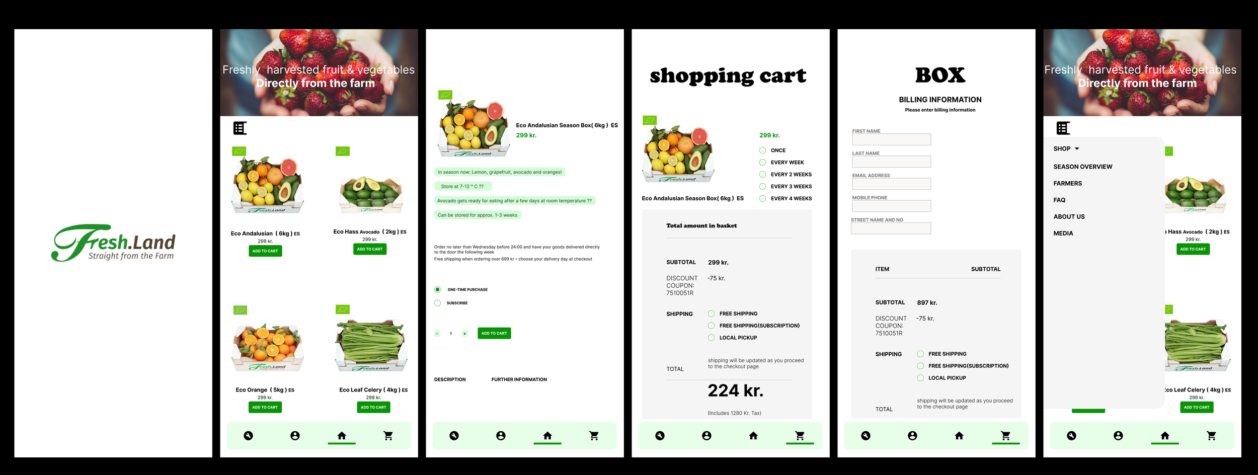
This app concept reimagines the farm-to-consumer shopping experience with a clean, eco-friendly design that brings simplicity, freshness, and trust to the forefront. The goal is to create a digital experience that reflects the values of Fresh.Land: natural products, sustainable farming, and direct access to seasonal fruits and vegetables.
🌿 Design Style and Visual Direction
The app embraces a clean, fresh, and organic design language. Visuals are dominated by bright natural imagery, minimalistic layouts, and soft rounded elements that mirror the simplicity of farm-fresh produce.
The interface avoids clutter and focuses on a smooth, intuitive shopping flow that helps users browse, select, and order produce with confidence.
Whitespace is used strategically to maintain clarity and give each product category room to breathe. A light and approachable typographic style enhances readability, while bold, rustic titles add personality and tie the UI back to the natural, earthy brand identity.
This design direction supports a shopping experience that feels honest, simple, and authentic.
🌈 Color Palette and Mood
The color palette is rooted in themes of freshness, nature, and sustainability.
The combination of bright greens, soft neutrals, and muted supporting tones creates a calm and clean mood.
Fresh Green signals natural products and is used for primary actions like “Add to Cart”
Light Mint Green introduces a soft, eco-friendly feel in backgrounds and highlights
White and Light Grey ensure clarity and emphasize purity
Dark Forest Green provides contrast for navigation and enhances accessibility
Together, these colors create a visual story that aligns perfectly with the brand’s mission of offering unprocessed, straight-from-the-farm food..
📱 UX and Layout Choices
The UX focuses on clarity, quick decision-making, and transparency around product freshness and seasonality. Key UX decisions include:
Simple and Clear Navigation
A bottom navigation bar offers quick access to the home screen, user profile, cart, and shopping menu. Icons are friendly and easy to recognize.Product Cards With Strong Visual Presence
Large images of produce boxes highlight the freshness and quality of the food.
Labels, price tags, and eco-badges are clearly visible without overwhelming the layout.Focus on Seasonality and Product Details
Product screens highlight seasonal items, storage recommendations, shelf life, and ripening notes. This builds trust and educates the consumer in an intuitive way.Clean Shopping Flow
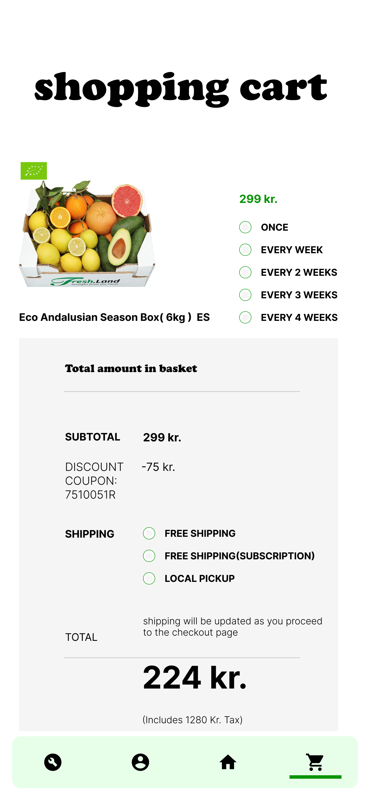
The shopping cart and billing screens prioritize clarity, with easy quantity adjustments, subscription options, discount visibility, and shipping choices.Accessible Sliding Navigation Menu
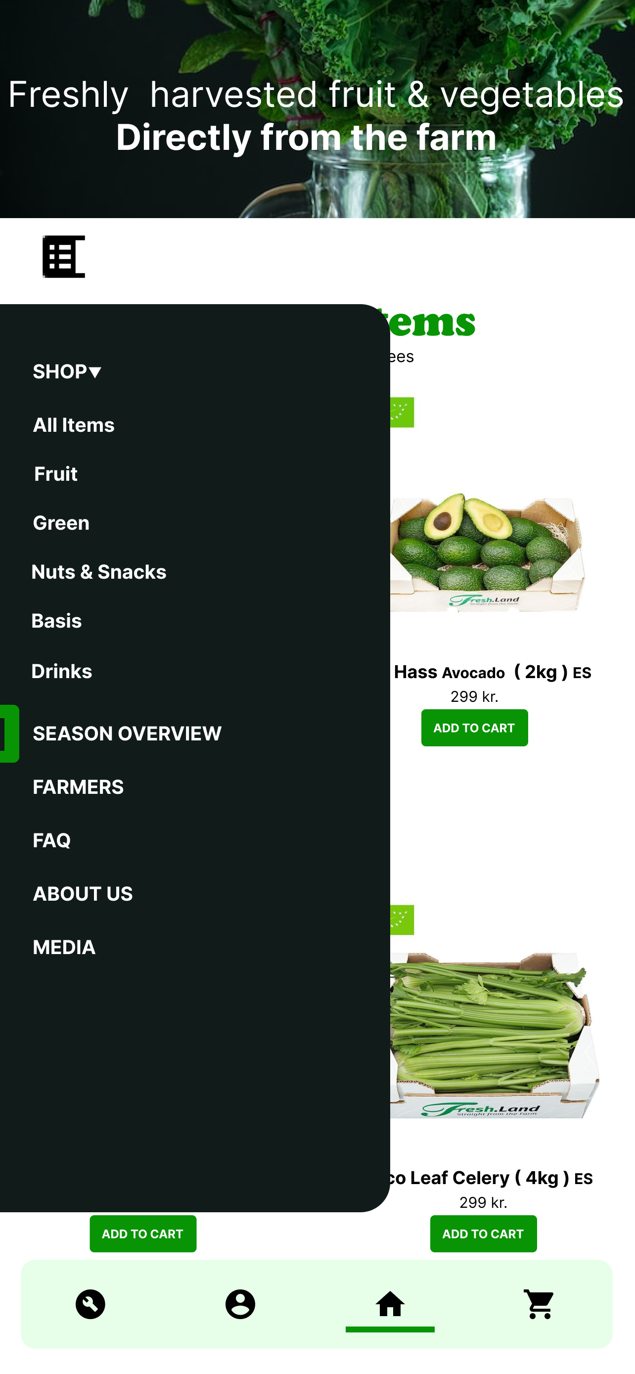
A full-height slide-out menu provides access to all categories such as fruit, green, nuts, snacks, farmers, FAQ, and more, helping users explore without effort.
Overall, the layout encourages informed and confident purchasing decisions.
🥕 Final Impression
The Fresh.Land app concept combines a clean, nature-inspired aesthetic with a simple and intuitive user experience. Every element, from the calming color palette to the crisp product photography, supports the brand’s mission of delivering fresh, high-quality produce directly from the farm.
This concept demonstrates how thoughtful UI choices, natural color themes, and a structured shopping journey can elevate the digital farm-to-table experience and build trust with modern consumers who value transparency and sustainability.
VIDEO WALKTHROUGH
This walkthrough showcases a clean, user-friendly shopping experience for fresh, farm-direct produce.
The demo reveals how users can browse seasonal boxes, view product details, customize orders, and navigate between shop, cart, and checkout with ease.
The design focuses on clarity, simplicity, and trust—using bright imagery, natural colors, and smooth navigation to make online grocery shopping feel more personal and effortless.
It’s a fresh and modern take on digital food retail.


